The brief:
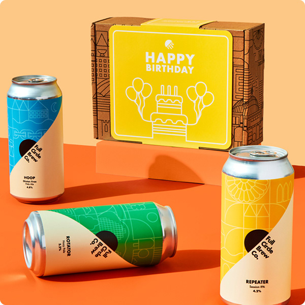
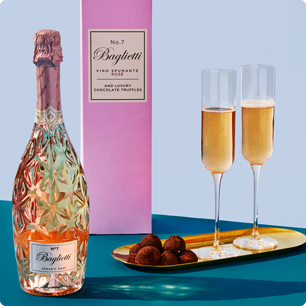
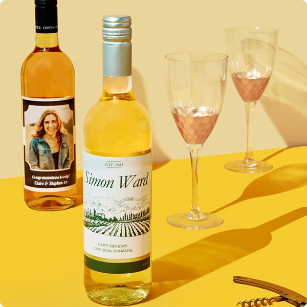
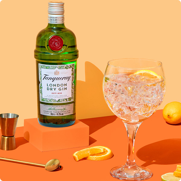
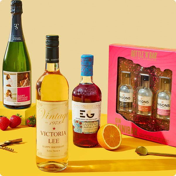
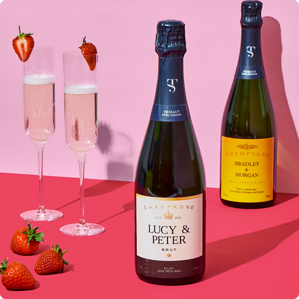
Design a visually impactful page that highlights key categories. Alcohol is a new addition for us, and it should be vibrant, eye-catching, and showcase the product's personalisation options.
Styling & Art Direction
Tonal horizons were strategically incorporated to enhance the products, creating a sense of depth and dimension for greater visual impact.
By blending gradients and subtle shifts in colour, these tonal variations help draw attention to key elements, making the products stand out while maintaining a cohesive and visually engaging composition.



Client: cardfactory.co.uk
Responsible and Accountable for:
Digital toolkit design
Wireframe design
Sample selection
Prop sourcing
Creative art direction
Final asset design
Final web build
